Graphic design project: Tattoo Zine

Graphic Design Project: Tattoo Zine

Research zines and develop a 20-page zine on the topic of your choice.

Course:

Communication Design for the Strategist

Project type

Design analysis
Zine creation and production
Individual project

The assignment

Overview

Select a topic, then develop a zine whose layout, color, and style enhances the content.

Topic selection

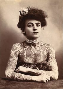
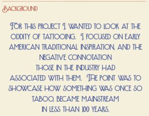
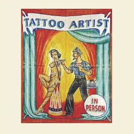
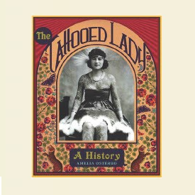
I am intrigued by the style of American traditional tattoos. In looking into the history of this style, I decided to focus on the “tattooed lady” phenomena.

Project goal

The focus of this project was developing layout and design skills, conducting in-depth topic research, and enhancing project management skills.

Ideation phase

Topic development

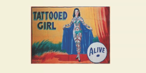
I find American Traditional tattoos to be fascinating, and am intrigued by how many of them are both timeless and of the era in which they arose.  After exploring various possible topics on this theme, I decided to explore the phenomena of “tattooed ladies” that were popular in travelling circuses at the turn of the 20th century. 

Gathering inspiration

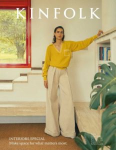
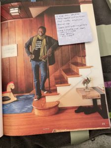
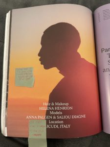
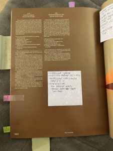
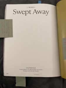
One of the early assignments was to select a magazine to be used for an in-depth analysis of design choices. After researching many magazines, at both the school library and at the amazing Casa Magazines shop, I selected Kinfolk Magazine. I chose this because of how its history meshed with the history of my chosen theme: Kinfolk was created as a reaction against the Seattle grunge aesthetic; the tattooed lady phenomena was a reaction against the limited options available to women of that era. I also liked the juxtaposition of the highly refined style of Kinfolk with the highly edgy style of my chosen topic.

Click to expand images


Research phase

Click to expand images

Topic research

While initially looking into the style of tattooing that is now known as American Traditional, I determined that the phenomena of “tattooed ladies” provided a rich area to explore. I learned that many (though certainly not all) of the women who embarked upon this career did so because it represented a rare career path for working-class women of the era. Not only were they able to take ownership of decisions made about their own bodies, this career allowed them to travel, earn a living, and often escape abusive relationships. 

Magazine analysis

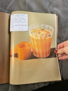
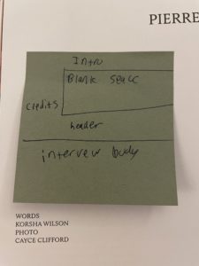
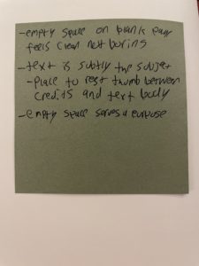
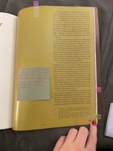
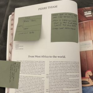
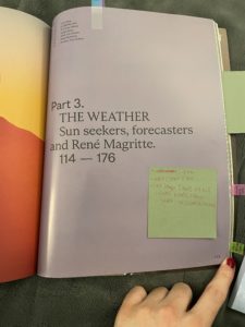
I spent a great deal of time analyzing how Kinfolk used page layouts to strengthen each story’s theme and topic. My goal was not to emulate their style, but to observe, examine, and document it, and to identify 20-30 points of inspiration to present to the class.

Surprising find:

Although the portrayal of tattooed ladies generally involved a victim narrative, this was often simply a means of maintaining respectability in the Victorian era. Many aspects of this career path actually provided a woman with more autonomy, freedom, and income than their society generally granted them.

Points of observation:

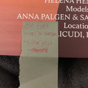
  • Single font on this page
  • Mix of ALL CAPS and lower case
  • White text on images
  • Design reads as TV/movie credit: stands out from next page
  • Prior image flows to this image:  feels transitional, start of something new
  • More than one type of paper used: physical indication of change
  • Two fonts, one very bold, with huge amounts of empty space:  clean, fresh, transitional
  • Plain page embodies “wind” theme of article
  • Article has no intro:  forces you to leave the last article abruptly
  • Large empty space on one side: the white is what stands out
  • Layout forces readers to engage, but still looks interesting
  • Image highlights features of a drink not traditional in the US:  modern take on old tradition
  • Image takes priority over the recipe on the left; clear instructions
  • History/culture explained, not just the recipe: fun descriptive writing
  • Personal opinion incorporated while staying consistent
  • Modern layout that feels calm, clean and natural
  • Page number is visible, but doesn’t disturb page flow
  • Image feels warm, bright
  • Heavily contrasts from text (left)
  • Shows subjects’ personality
  • Staging feels home-like, not busy
  • Image is different from others:  feels less staged, more personal, less curated
  • Text is subtly the subject
  • Empty space on blank page feels clean, not boring
  • White space provides place to rest thumb between credits & text body:  empty space serves a purpose
  • Some spreads are cohesive; some show L-R break to indicate transition to next topic

SUMMARY OF FINDINGS:

In researching this topic, I discovered that becoming a “tattooed lady” was often as much a story of female empowerment as of being taken advantage of and gawked at as a “circus freak” sideshow act.  While we would judge the decision to follow this route very differently through today’s lens, at the time, it was a bold choice that a woman could take that would provide the opportunity to maintain autonomy over her decisions and her body, earn a living, and – often – provide a way to escape an abusive marriage.

Design development

Design ideation

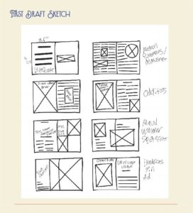
Using the points of inspiration I identified in the research phase, I created rough sketches of page layouts designed to fit the text and images I wanted to include.

Content sourcing

I identified images and articles found during my research that would fit the theme and would work well together to describe the history of the tattooed lady phenomena and show how its influence is still felt today.

Typography and color palette

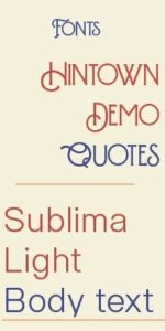
I selected the font Hintown for titles and accent text, as it evokes the style of turn-of-the-century circus posters and is gritty yet at the same time elegant. For body text, I chose the Sublime font. This easy-to-read font is modern, but also pairs well with Hintown.

Click any image to open slideshow


Design and critique phase

Draft layouts

Based on my layout sketches, I created drafts of the cover, back cover, and inside spreads.

Peer critique

Each week, our project was posted on the wall for critique by classmates. After presenting my concept and first draft, classmates provided feedback on the project’s strengths and weaknesses.

Revise and iterate

Taking this feedback, I continued to refine and develop my zine. Although the feedback significantly influenced my final design, I also had to learn when to trust my instincts.

Finalize and present

The final phase included an in-class presentation to describe my research process, explain my content and design decisions, and discuss lessons learned.

Two sample spreads from initial zine prototype

Final Zine

Click the image below to launch an electronic version of this zine:

Related project

Below is the video I created in the next phase of the class, presenting a broader overview of the American Traditional tattoo style:

Summary

Key tasks

Historical research
Ideation
Page spread development
Sourcing content
Creating content
Digital prototyping

Deliverables

Background research
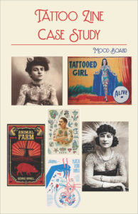
Mood board
Page spread mockups
Completed zine
Verbal presentation

Tools

Adobe InDesign
Adobe Illustrator
Adobe Photoshop


Consulting project: ideating partnership opportunities for Ben & Jerry’s

Ideating partnership opportunities for Ben & Jerry’s

Analyze a company’s mission statement and public persona to identify priorities, proposing three potential strategic partnerships for a company of your choice.

Course:

Design of Business

Project type

Research
Analysis
Ideation
Individual project

The assignment

Overview

The purpose of this project was to analyze a company’s public persona: press releases, marketing campaigns, senior executive’s statements, etc., and identify three potential partnerships to help them further solidify/build/strengthen that perception in the marketplace.

Company selection

After researching a number of companies, I chose Ben & Jerry’s Homemade Holdings, partly because it is an independent subsidiary of a larger public company. I was interested in exploring the complexities of how a subsidiary of a larger corporation can maintain its unique brand identity within the structure of a larger organization, and how that might affect potential partnerships.

Research and analysis phase

Collect research

Using a variety of sources, including company website, parent company website, and other publicly-available resources, conducted research to assess company’s public persona.

Public image analysis

Company description: international food manufacturer (ice cream)
Ownership type: wholly-owned subsidiary with independent board (owned by Unilever; allowed to operate relatively independently)
Other factors:
outspoken on political and social issues
strives to maintain vision and image as a “grassroots” organization, despite being owned by a large public company
Prioritizes making decisions in line with their mission statement over adhering to parent company’s priorities and values.

Partnership opportunity 1: Ben & Jerry’s + Tesla

Partnering with electric vehicle company for distribution trucks

Rationale:

If Ben and Jerry’s were to partner with an electric vehicle company that makes semi trucks for distribution, this could be a strong partnership.

Benefit to Ben & Jerry’s:

Decreased greenhouse emissions and reduced transportation/ distribution costs
The main benefit to this partnership would be drastically reducing the pollution in all steps of distribution. Ben and Jerry’s benefits by lowering distribution costs, and getting another point to back up their goal of being fully sustainable as an organization.

Partner benefit:

Increased perceived social justice awareness
In a partnership between Tesla and Ben and Jerry’s, Tesla would benefit by having a major corporate partner with a strong social justice awareness, in addition to the environmental benefits the two companies share.

Risk:

Distribution disruption
Ben and Jerry’s would need to invest in ensuring their distribution remains as reliable as with normal distribution methods. While this technology is new and beneficial, it’s not as developed as normal trucks.

Risk mitigation:

Building redundancy
A way to counteract this in the first few years of partnership may be spending more on backup equipment and drivers, investing in warehouse space near major cities in case something goes wrong.
Similar to the ecosystem reimagine, they would need to create insurance for themselves to maintain quality service. If they invest more upfront and be an early adopter of this technology they can cater these new tools and resources to fit their needs more specifically. Simply understanding that this is a new technology, and there will be mechanical errors going into it, that they need to be ready for.

Partnership opportunity 2: Ben & Jerry’s + small local farms

Adding selective sourcing of milk directly from small local farms to current sourcing through large dairy cooperative

Rationale:

Factory farming is responsible for a large portion of pollution. Ben & Jerry’s is vocal about coming from Vermont and supporting local agriculture. If they were to partner with small local farms in Vermont, in addition to the dairy cooperative that they currently source from, they could support local farmers and businesses more directly, as well as stop supporting pollution produced by the major factory farms.

Benefit to Ben & Jerry’s:

Quality control of input ingredients and enhanced public perception
Ben and Jerry’s could be incentivized to do this because they would be getting a higher quality product, supporting the community they advertise as being so involved in, and getting to market these products in a way people would be enticed by.

Partner benefit:

More secure income stream, higher profile
Farms involved in this partnership would get a steady contract from a reputable major local business, which would help them combat the large farms that are often threatening their ability to keep a successful business.

Challenges:

Logistics
The issue with this partnership would be that instead of sourcing from one large supplier, they would need a network of smaller farms with a consistent amount of product comparable to what they could get before. This would require them to create a team internally that develops, oversees, and ensures that the farms are functioning smoothly for what they need. The biggest change is actually receiving the product from a variety of smaller suppliers, and creating a team that can manage it.

Risks:

Supply issues, consistency of key input ingredient
The biggest issue with this partnership would be a variation of consistency in the product they receive. Since they wouldn’t be getting their product from one large supplier, that means that there are a lot more moving parts that could go wrong, the biggest of which being different types of ingredients going into the same product. They would need to find a way to ensure their product stays the same.

Partnership opportunity 3: Ben & Jerry’s + HelloFresh

Increasing product awareness and sustainability perception by partnering with home delivery meal kit company

Rationale:

Since HelloFresh puts an emphasis on reducing food waste and delivering high-quality products, these two brands share similarities that could be beneficial to both of them. Since both of these brands are established, this partnership would be more advertising for their products that are supporting social causes.

Benefit to Ben & Jerry’s:

Adding new distribution channel with shared values
Ben and Jerry’s would get to send their product to tens of thousands of homes every week, and still be pushing more sustainable routes of business growth.

Partner benefit:

Adding enhanced brand recognition to premium product offerings
The motivation for HelloFresh would be to expand their newer revenue stream of “add-ons”. Many of these products aren’t name brand currently, so a big company endorsing that would be helpful.

Shared benefit:

Solidifying status as premium product in each firm’s category
Since Ben and Jerry’s is on the more expensive side of ice cream, that falls perfectly into HelloFresh’s client base which is predominantly young adults with some amount of disposable income.

Risks:

Issues with partner’s reputation could adversely affect sustainability credibility
There is very little risk to this partnership for Ben & Jerry’s, except for ensuring that HelloFresh is able to maintain Ben and Jerry’s brand image and quality standards. There is no financial risk to Ben & Jerry’s once the products are in HelloFresh’s inventory.

Presentation phase

In-class presentation

The above findings were presented in class.

Key takeaways

Although the purpose of this project was to come up with broad ideas for partnerships for our chosen company, it would be interesting to look into these opportunities further to identify additional risks, benefits, and considerations.


Summary

Key tasks

Research
ideation

Deliverables

Company selection
Background research
Key observation report


Sneaker trend magazine spread

Sneaker trend magazine spread

Collect primary and secondary research and create a magazine spread emulating a real-world magazine.

Course:

Information Visualization

Project type

Data collection
Data analysis
Presentation
Team project

The assignment

Overview

Working with teammates, identify a topic, collect and analyze data, and present the data by creating a magazine spread inspired by a real-world magazine.

Topic selection

Our team observed that Nike Air Force 1 sneakers have retained popularity over a number of decades and decided that it would be a topic that would work for all aspects of the assignment.

Research phase

Collect primary research

To create our dataset, each member of the group went to NYC’s SoHo neighborhood and took pictures of 50 random shoes.

Assess magazine layout styles

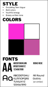
Our team researched and analyzed a wide variety of magazines. We decided Teen Vogue had the aesthetic and target audience that made sense for our white sneaker trend topic.

Preparation phase

Compile and analyze data

We imported our images into Adobe Bridge and added metadata, tagging each photo to capture the two relevant data points: shoe brand and color.

Develop Marketing Profile

I was responsible for creating a robust marketing profile, including key demographic information, background, and motivators. This was used throughout the project to ensure that we maintained the appropriate voice for the project.

Create written content

I was responsible for writing an article focused on the color we had chosen (white), using the tone and voice consistent with Teen Vogue‘s style; other team members wrote articles as well.

Design phase

Discuss digital layout

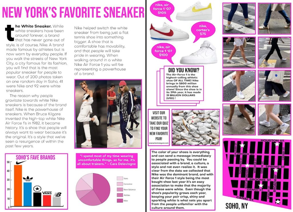
One team member created a draft layout; we then collaborated to iterate a spread tailored for our content and in the style of Teen Vogue.

Complete layout

I was one of two co-editors who took the photos, articles, headlines, and initial mockup and created the final layout. We spent considerable time selecting the photos to create a consistent theme, reviewing issues of Teen Vogue to develop a clear sense of their layout style and voice, and organizing the content to best highlight each team member’s contribution.

Finalize and present

We presented all our data and research and walked our classmates through each step of the process. We then engaged in a conversation about our work, why we chose this trend and other supporting materials.

Group project: magazine spread in the style of Teen Vogue

Summary

My contribution

Primary research
Secondary research
Data analysis
Data tagging
Marketing profile
Short form article
Final layout (with co-editor)

Team deliverables

Data set report
Data analysis
Charts
Key observation report
Marketing profile
Written articles
Two-page magazine spread layout

Tools

Adobe Bridge
Adobe InDesign
Adobe Photoshop
iPhone camera
Tableau


“This vs. that” comparison: grocery store infographic

“This vs. that” comparison: grocery store infographic

Using primary and secondary research to analyze a topic and find ways to highlight the similarities and differences.

Course:

Information Visualization

Project type

“This vs. that” comparison
Analysis
Individual project

The assignment

Overview

Create a “this vs. that” infographic, displaying one or more facets of comparison between two related items in the topic of your choice.

Topic selection

I often shop at two stores in my neighborhood, and realized that exploring the similarities and differences would allow me to identify the reasons someone might choose one over the other for some or all of their grocery shopping needs.

Project goal

The focus of this project was conducting research and practicing rapid iteration.

Research phase

Conduct site visits

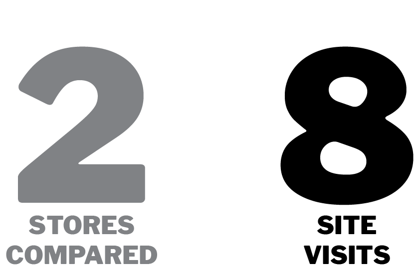
I conducted several site visits at each store, observing customers, documenting floor space usage, and identifying how each store’s product placement and layout was designed to attract their target customer.

Assess brand identity

The online research component of the project consisted of collecting qualitative and quantitative data from the stores’ websites as well as from other publicly-available sources to determine how each store presented itself, and the types of customers they appeared to be targeting.


Analysis phase

Develop personas

I created several customer personas based on my in-store visits, each designed to reflect the major types of customers I observed. Each persona definition included an assessment of the criteria they used to make purchasing decisions (price, convenience, quality, etc.).

Identify themes

In looking at the data I collected, several key themes emerged. These revealed differences in priorities that resulted in different opinions about what the “right” grocery store would be for that person and/or that situation.

Select data sets

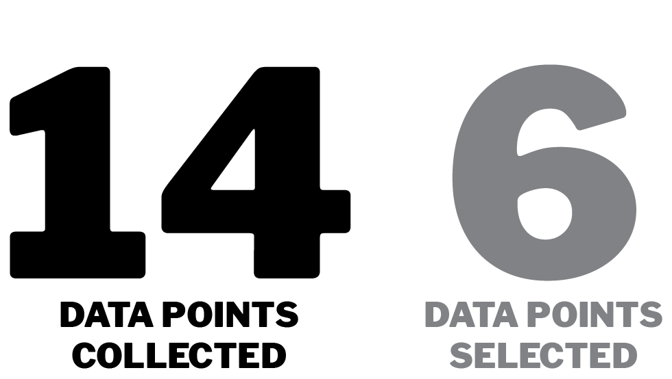
From the fourteen data sets I collected, I chose six, including both quantitative and qualitative data types, that I felt represented a diverse set of decision-making options. I selected data points that appeared in multiple personas, particularly those for which different personas would make different assessments about what the “better” choice was. I also included some areas for which the two stores were similar enough that it would not represent a factor in decision-making.


Iteration phase

First draft visualization

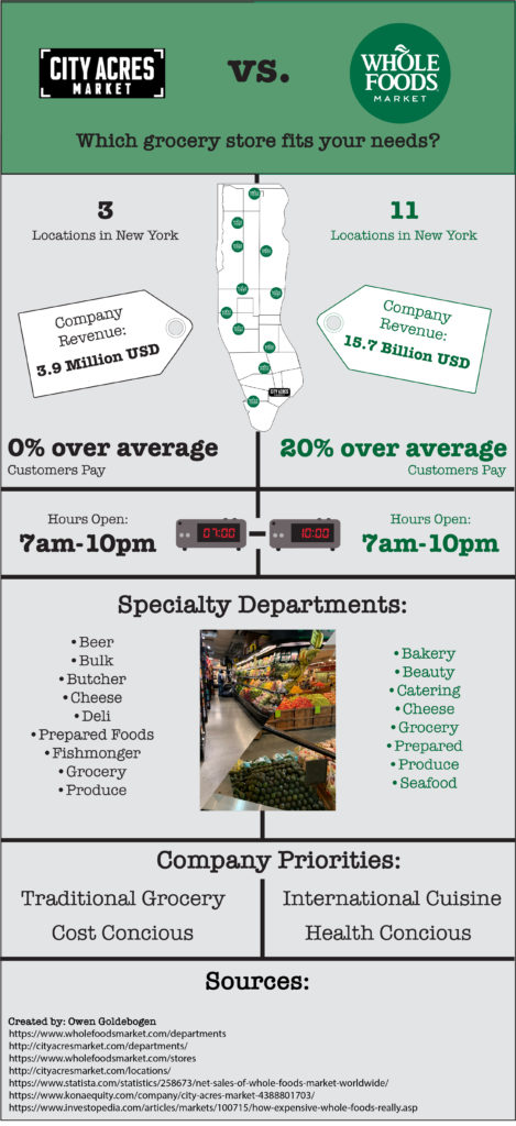
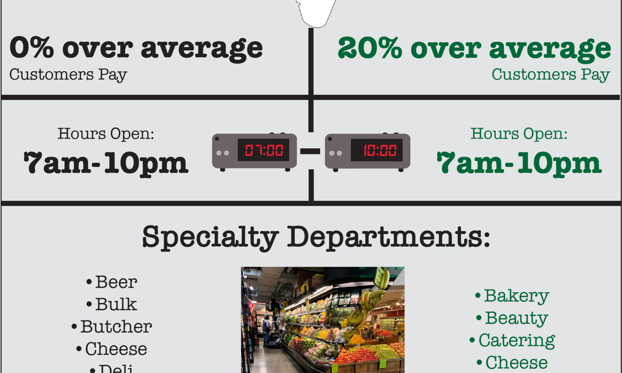
I used Adobe Photoshop and Illustrator to create my first draft, working to select the best way to represent each data item, while also working to create a cohesive final product. I decided to style my infographic in the style of a retro newspaper, using a grey background, typewriter-inspired font, and bold lines.

Peer critique

After presenting my concept and first draft, classmates provided feedback on the project’s strengths and weaknesses.

Revise and iterate

Taking this feedback, I continued to refine and develop my infographic to ensure that all aspects were immediately understandable and styling was consistent with the theme.

Finalize and present

The final phase included an in-class presentation to describe my research process, explain my content and design decisions, and discuss lessons learned.

Rapid prototype infographic in the style of a retro newspaper

Summary

Key tasks

Primary observational research
Secondary research (web-based)
Data analysis
Digital prototyping

Deliverables

Data collection
Data analysis
Persona creation
User journey map
Site visits
Industry background research
Price comparisons
Infographic

Tools

Adobe Bridge
Adobe Illustrator
Adobe Photoshop
iPhone camera
Microsoft Excel
Microsoft Word


“This vs. that” comparison: grocery store infographic

Course: Information Visualization

Project type: “This vs. that” comparison, individual project

The assignment

Overview
Create a “this vs. that” infographic, displaying one or more facets of comparison between two related items in the topic of your choice.

The focus of this project was conducting research and rapid iteration.

Topic selection
I often shop at two stores in my neighborhood, and realized that exploring the similarities and differences would allow me to identify the reasons someone might choose one over the other for some or all of their grocery shopping needs.

The project

Phase 1

Select topic

I often shop at two stores in my neighborhood, and realized that exploring the similarities and differences would allow me to identify the reasons someone might choose one over the other for some or all of their grocery shopping needs.

Conduct site visits

I conducted several site visits at each store, observing customers, documenting floor space usage, and identifying how each store’s product placement and layout was designed to attract their target customer.

Phase 2
Step 3

Identify themes

 In looking at the data I collected, there were several key areas that people might use to select the “right” grocery store for their needs, depending on their priorities.

Select data sets

From the fourteen data sets I collected, I chose six, including both quantitative and qualitative data types, that I felt represented a diverse set of decision-making options.

Step 4
Step 5

First draft visualization

I then used Adobe Photoshop and Illustrator to create my first draft, working to select the best way to represent each piece, while also working to create a cohesive final product.

Peer critique

After presenting my concept and first draft, classmates provided feedback on the project’s strengths and weaknesses.

Step 6
Step 7

Revise and iterate

Taking this feedback, I continued to refine and develop my infographic to ensure that all aspects were immediately understandable.

Finalize and present

The final phase included presenting the final product for presentation and critique.

Step 8
Click on image for full size version.

Software used

Adobe Photoshop
Adobe Illustrator

Adobe Bridge

Skills demonstrated

Primary research gathering (in-person site visits)

Secondary research gathering (web-based research)

Data analysis

2D layout

Rapid iteration