Graphic Design Project: Tattoo Zine
Research zines and develop a 20-page zine on the topic of your choice.

Course:
Communication Design for the Strategist
Project type
The assignment
Ideation phase


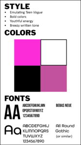
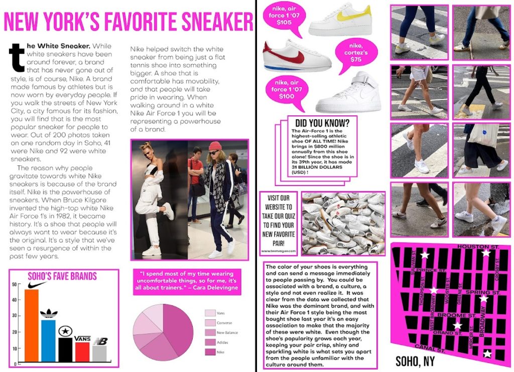
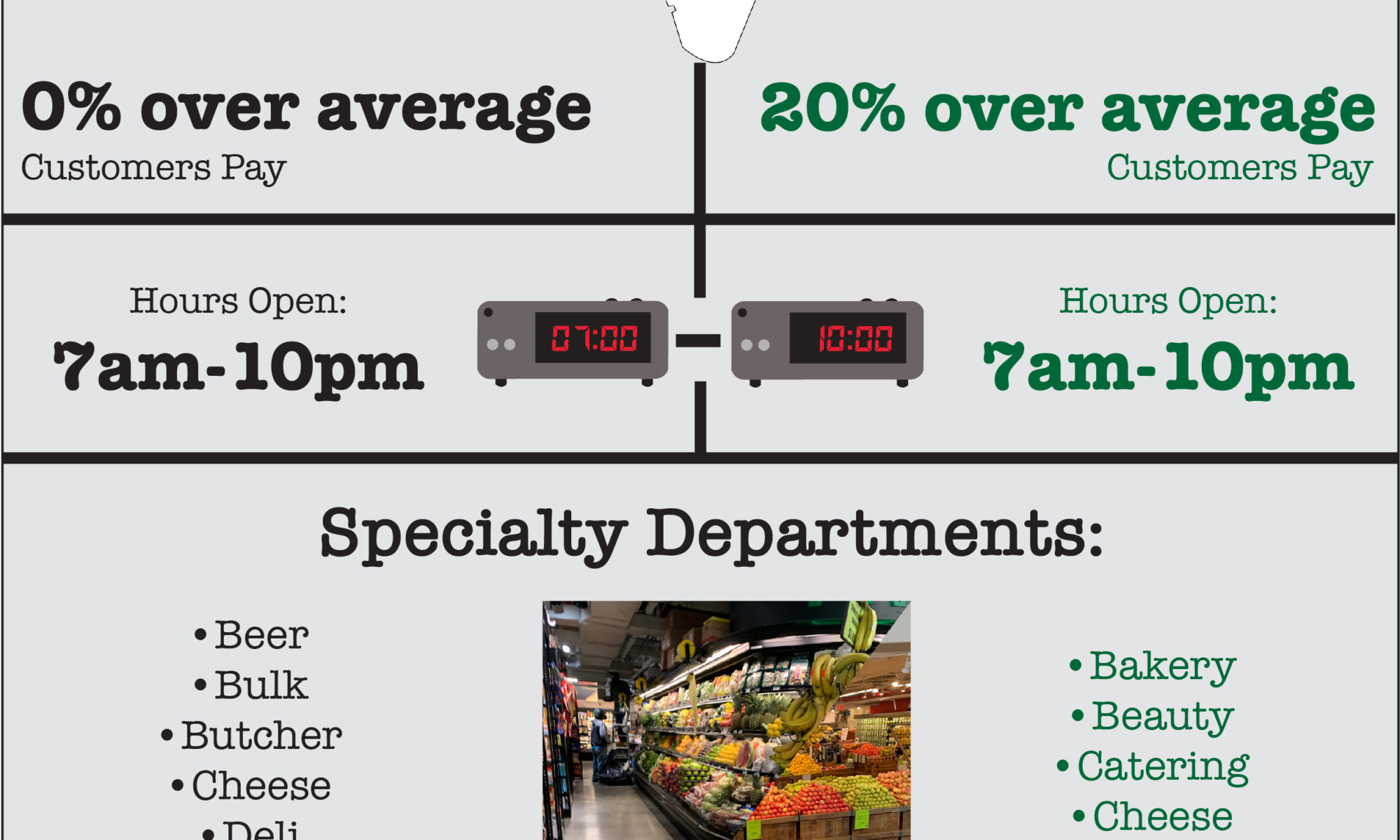
Research phase
Click to expand images
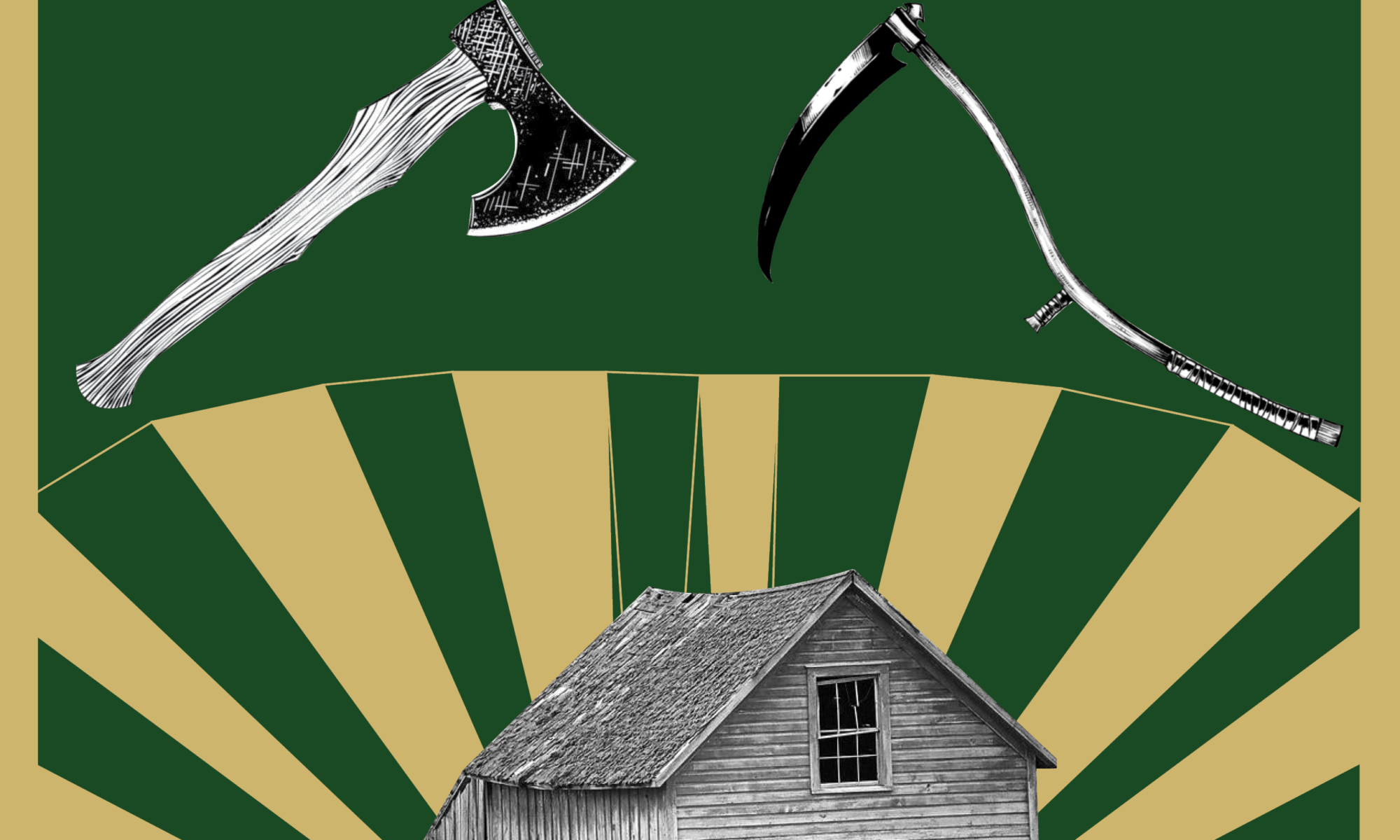
Surprising find:
Although the portrayal of tattooed ladies generally involved a victim narrative, this was often simply a means of maintaining respectability in the Victorian era. Many aspects of this career path actually provided a woman with more autonomy, freedom, and income than their society generally granted them.


Points of observation:
- Single font on this page
- Mix of ALL CAPS and lower case
- White text on images
- Design reads as TV/movie credit: stands out from next page
- Prior image flows to this image: feels transitional, start of something new
- More than one type of paper used: physical indication of change
- Two fonts, one very bold, with huge amounts of empty space: clean, fresh, transitional
- Plain page embodies “wind” theme of article
- Article has no intro: forces you to leave the last article abruptly
- Large empty space on one side: the white is what stands out
- Layout forces readers to engage, but still looks interesting
- Image highlights features of a drink not traditional in the US: modern take on old tradition
- Image takes priority over the recipe on the left; clear instructions
- History/culture explained, not just the recipe: fun descriptive writing
- Personal opinion incorporated while staying consistent
- Modern layout that feels calm, clean and natural
- Page number is visible, but doesn’t disturb page flow
- Image feels warm, bright
- Heavily contrasts from text (left)
- Shows subjects’ personality
- Staging feels home-like, not busy
- Image is different from others: feels less staged, more personal, less curated
- Text is subtly the subject
- Empty space on blank page feels clean, not boring
- White space provides place to rest thumb between credits & text body: empty space serves a purpose
- Some spreads are cohesive; some show L-R break to indicate transition to next topic
SUMMARY OF FINDINGS:
In researching this topic, I discovered that becoming a “tattooed lady” was often as much a story of female empowerment as of being taken advantage of and gawked at as a “circus freak” sideshow act. While we would judge the decision to follow this route very differently through today’s lens, at the time, it was a bold choice that a woman could take that would provide the opportunity to maintain autonomy over her decisions and her body, earn a living, and – often – provide a way to escape an abusive marriage.
Design development


Design and critique phase

Final Zine
Click the image below to launch an electronic version of this zine:
Related project
Below is the video I created in the next phase of the class, presenting a broader overview of the American Traditional tattoo style:
Summary
Key tasks
Historical research
Ideation
Page spread development
Sourcing content
Creating content
Digital prototyping
Deliverables
Background research
Mood board
Page spread mockups
Completed zine
Verbal presentation
Tools
Adobe InDesign
Adobe Illustrator
Adobe Photoshop