

“This vs. that” comparison: grocery store infographic
Using primary and secondary research to analyze a topic and find ways to highlight the similarities and differences.
Course:
Information Visualization
Project type
The assignment
Research phase
Analysis phase
Iteration phase
Summary
Key tasks
Primary observational research
Secondary research (web-based)
Data analysis
Digital prototyping
Deliverables
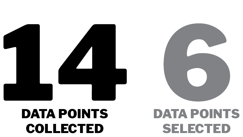
Data collection
Data analysis
Persona creation
User journey map
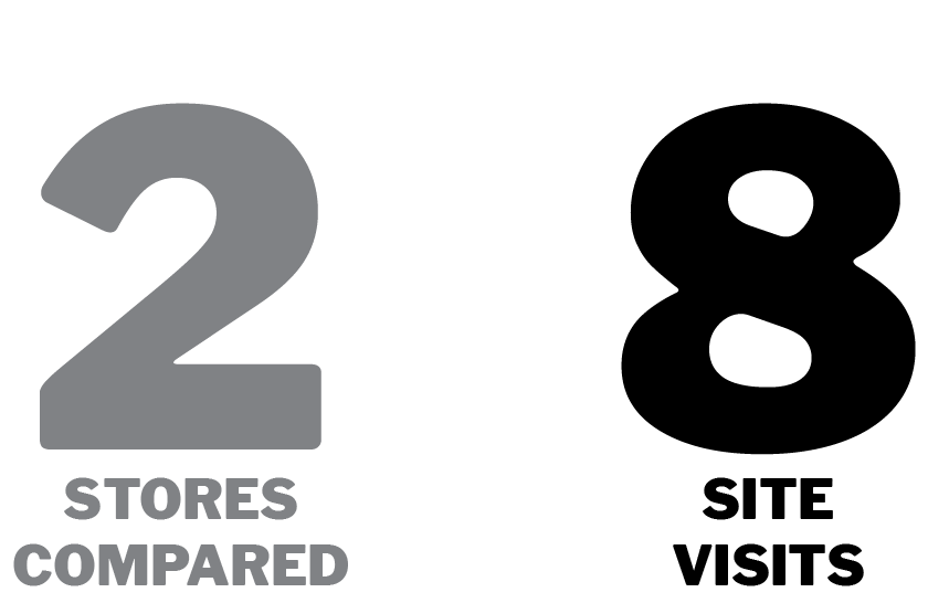
Site visits
Industry background research
Price comparisons
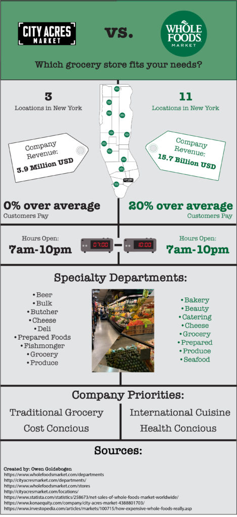
Infographic
Tools
Adobe Bridge
Adobe Illustrator
Adobe Photoshop
iPhone camera
Microsoft Excel
Microsoft Word